Clean • Professional
Responsive frameworks help developers create websites that look great on all devices without writing excessive custom CSS. Two of the most popular frameworks are Bootstrap and Tailwind CSS. Let’s explore them in detail with examples.
Bootstrap is a component-based CSS framework with pre-designed UI elements, a responsive 12-column grid, and utility classes to speed up development. It helps create consistent, professional layouts quickly.
Key Features:
<!DOCTYPE html>
<html lang="en">
<head>
  <meta charset="UTF-8">
  <meta name="viewport" content="width=device-width, initial-scale=1">
  <title>Bootstrap Example</title>
  <link href="<https://cdn.jsdelivr.net/npm/[email protected]/dist/css/bootstrap.min.css>" rel="stylesheet">
</head>
<body>

<!-- Header Section -->
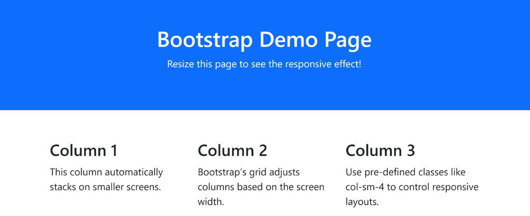
<div class="container-fluid p-5 bg-primary text-white text-center">
  <h1>Bootstrap Demo Page</h1>
  <p>Resize this page to see the responsive effect!</p>
</div>

<!-- Responsive Grid Section -->
<div class="container mt-5">
  <div class="row">
    <div class="col-sm-4">
      <h3>Column 1</h3>
      <p>This column automatically stacks on smaller screens.</p>
    </div>
    <div class="col-sm-4">
      <h3>Column 2</h3>
      <p>Bootstrap’s grid adjusts columns based on the screen width.</p>
    </div>
    <div class="col-sm-4">
      <h3>Column 3</h3>
      <p>Use pre-defined classes like col-sm-4 to control responsive layouts.</p>
    </div>
  </div>
</div>

<script src="<https://cdn.jsdelivr.net/npm/[email protected]/dist/js/bootstrap.bundle.min.js>"></script>
</body>
</html>
Output :

A utility-first CSS framework that lets you design directly in HTML using utility classes, without separate CSS files.
Key Features:
sm:, md:, lg:) and state (hover:, focus:) variants<!DOCTYPE html>
<html lang="en">
<head>
<meta charset="UTF-8">
<meta name="viewport" content="width=device-width, initial-scale=1">
<title>Tailwind CSS Example</title>
<script src="<https://cdn.tailwindcss.com>"></script>
</head>
<body class="bg-gray-100">
<!-- Header Section -->
<header class="bg-blue-600 text-white p-8 text-center">
<h1 class="text-3xl font-bold">Tailwind CSS Demo Page</h1>
<p class="mt-2">Resize this page to see the responsive effect!</p>
</header>
<!-- Responsive Card Section -->
<div class="container mx-auto mt-8 grid gap-6 sm:grid-cols-1 md:grid-cols-2 lg:grid-cols-3 px-4">
<div class="bg-white p-6 rounded-lg shadow-lg">
<h3 class="text-xl font-semibold mb-2">Card 1</h3>
<p class="text-gray-700">Tailwind utility classes make it easy to design responsive cards quickly.</p>
</div>
<div class="bg-white p-6 rounded-lg shadow-lg">
<h3 class="text-xl font-semibold mb-2">Card 2</h3>
<p class="text-gray-700">The grid adapts automatically across devices using responsive utilities.</p>
</div>
<div class="bg-white p-6 rounded-lg shadow-lg">
<h3 class="text-xl font-semibold mb-2">Card 3</h3>
<p class="text-gray-700">No custom CSS required — design everything directly in HTML.</p>
</div>
</div>
</body>
</html>
Output :
