Clean • Professional
Today, people use mobiles, tablets, laptops, and big desktop screens to browse the web. That’s why having a responsive layout is a must. A responsive design makes your website adjust to any screen size, so users don’t need to zoom or scroll too much.
CSS is the key to creating these layouts. Let’s see how it works.
A responsive layout is a web design method that makes a webpage look good on all devices. Instead of making separate designs for mobile and desktop, you create one flexible design that fits everywhere.

For example:
Instead of fixed pixel widths, use relative units like %, em, rem, vw, and vh. This helps your layout resize naturally on any screen.
.container {
  width: 90%;   /* adjusts with screen size */
  margin: 0 auto;
  background: #f0f0f0;
  padding: 20px;
}

.box {
  width: 45%;   /* flexible width */
  background: #4caf50;
  color: #fff;
  padding: 20px;
  margin: 10px;
  float: left;
}
<div class="container">
  <div class="box">Box 1</div>
  <div class="box">Box 2</div>
</div>
CSS Media Queries
Media queries are the backbone of responsive design. They allow you to apply different CSS rules for different screen sizes.
/* Desktop (default) */
.container {
  display: flex;         /* boxes in a row */
  gap: 20px;
}

.box {
  flex: 1;
  background: #4caf50;
  color: #fff;
  padding: 20px;
  text-align: center;
}

/* Tablet (max width 992px) */
@media (max-width: 992px) {
  .container {
    flex-direction: column; /* stack boxes */
  }
}

/* Mobile (max width 576px) */
@media (max-width: 576px) {
  .container {
    font-size: 14px;  /* smaller text */
  }
}
<div class="container">
  <div class="box">Box 1</div>
  <div class="box">Box 2</div>
  <div class="box">Box 3</div>
</div>
Flexbox makes layouts flexible and easier to manage without using floats. It lets items grow, shrink, or wrap into new rows when the screen is smaller.
.flex-box {
  display: flex;
  flex-wrap: wrap;   /* items move to next row if space is less */
  gap: 20px;
}

.flex-item {
  flex: 1 1 300px;   /* grow, shrink, min-width */
  background: #4caf50;
  color: #fff;
  padding: 20px;
  text-align: center;
}
<div class="flex-box">
  <div class="flex-item">Item 1</div>
  <div class="flex-item">Item 2</div>
  <div class="flex-item">Item 3</div>
  <div class="flex-item">Item 4</div>
</div>
CSS Grid is a powerful layout system that gives you full control over rows and columns. It’s perfect for creating complex layouts like dashboards, galleries, or magazine-style designs.
.grid-container {
  display: grid;
  grid-template-columns: repeat(auto-fit, minmax(250px, 1fr));
  gap: 20px;
}

.grid-item {
  background: #2196f3;
  color: #fff;
  padding: 20px;
  text-align: center;
}
<div class="grid-container">
  <div class="grid-item">Item 1</div>
  <div class="grid-item">Item 2</div>
  <div class="grid-item">Item 3</div>
  <div class="grid-item">Item 4</div>
  <div class="grid-item">Item 5</div>
  <div class="grid-item">Item 6</div>
</div>
Text should resize smoothly on all devices. The clamp() function helps set a minimum, preferred, and maximum font size.
h1 {
  font-size: clamp(1.5rem, 2vw, 3rem);
}

p {
  font-size: clamp(1rem, 1.5vw, 1.5rem);
}
<h1>Responsive Heading</h1>
<p>This is a responsive paragraph with scalable text.</p>
Images should adjust to screen size so they don’t overflow.
.responsive-img {
  max-width: 100%;
  height: auto;
}
<img src="image.jpg" alt="Example" class="responsive-img">
<picture>)<picture>
<source srcset="image-large.jpg" media="(min-width: 992px)">
<source srcset="image-medium.jpg" media="(min-width: 576px)">
<img src="image-small.jpg" alt="Responsive Example">
</picture>
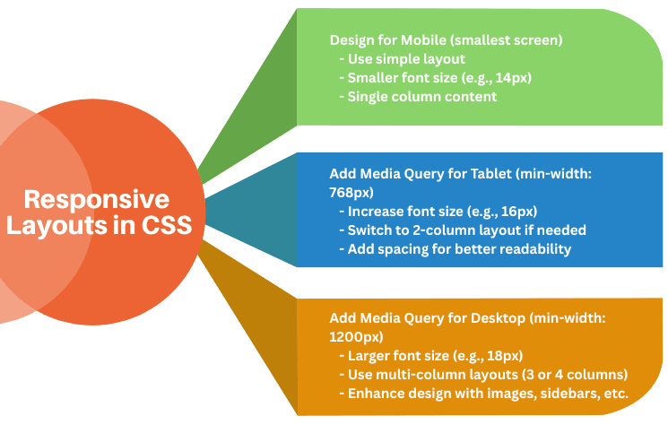
In a mobile-first design, you start styling for small screens first, then use media queries to adjust for larger screens. This makes your website faster and more usable on mobiles.
/* Base styles for mobile */
p {
  font-size: 14px;
  color: #333;
}

/* Tablet and larger screens */
@media (min-width: 768px) {
  p {
    font-size: 16px;
  }
}

/* Desktop and larger screens */
@media (min-width: 1200px) {
  p {
    font-size: 18px;
  }
}<p>This is a responsive paragraph using a mobile-first approach.</p>