Clean • Professional
While pseudo-classes let us style elements based on their state, pseudo-elements allow us to style specific parts of an element or even insert extra content without changing the HTML.
Pseudo-elements are powerful because they help us:

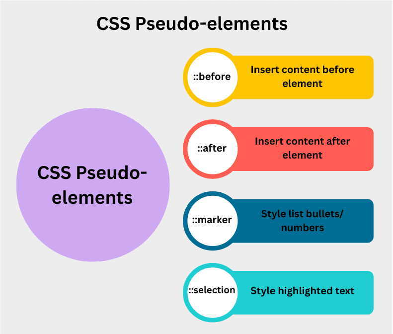
::before – Insert Content Before an Element
The ::before pseudo-element is used to insert content before an element’s content. This is commonly used for adding icons, quotes, or decorations without extra HTML.
h1::before {
  content: "★ ";
  color: gold;
}
::after – Insert Content After an Element
The ::after pseudo-element inserts content after an element’s content. Often used for adding visual indicators, decorative lines, or helper text.
a::after {
  content: " 🔗";
  color: gray;
}
::marker – Style List Markers
The ::marker pseudo-element lets you style the bullet points or numbers in lists (<ul> and <ol>). This gives designers full control over how list markers appear.
li::marker {
  color: red;
  font-size: 18px;
}
::selection – Style Selected Text
The ::selection pseudo-element allows you to style the portion of text a user highlights with their mouse or keyboard.
p::selection {
  background: yellow;
  color: black;
}

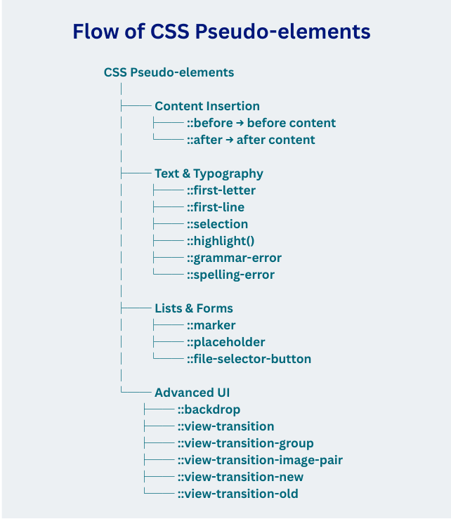
| Pseudo-element | Example | Description |
|---|---|---|
::after | p::after, div::after | Inserts content after the specified element’s content. |
::backdrop | dialog::backdrop | Styles the background (viewbox) behind a <dialog> or popover. |
::before | p::before, div::before | Inserts content before the specified element’s content. |
::file-selector-button | ::file-selector-button | Targets the button of an <input type="file">. |
::first-letter | p::first-letter | Styles the first letter of a block of text. |
::first-line | p::first-line | Styles the first line of a block of text. |
::grammar-error | ::grammar-error | Highlights text flagged as grammatically incorrect by the browser. |
::highlight() | ::highlight(custom-name) | Allows custom text highlights using the ::highlight() API. |
::marker | li::marker | Styles the list markers (bullets or numbers) in lists. |
::placeholder | input::placeholder, textarea::placeholder | Styles placeholder text inside form fields. |
::selection | ::selection | Styles text selected by the user (highlighted). |
::spelling-error | ::spelling-error | Highlights text flagged as misspelled by the browser. |
::view-transition | ::view-transition | Represents the root overlay container for view transitions. |
::view-transition-group | ::view-transition-group | Represents a single group of view transition snapshots. |
::view-transition-image-pair | ::view-transition-image-pair | Container for an image pair in view transitions (old + new). |
::view-transition-new | ::view-transition-new | Represents the new state of a view transition. |
::view-transition-old | ::view-transition-old | Represents the old state of a view transition. |