Clean • Professional
When learning CSS, one of the first (and most important) concepts is the Box Model and Layout properties. These determine how every element is sized, spaced, and positioned on a web page. Think of it like building blocks of a website—if you understand this, you can control how your design looks and behaves.
In this guide, we’ll cover everything about the CSS Box Model and Layout in simple language with practical examples.
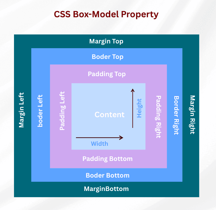
The CSS Box Model describes how every element on a webpage is structured. Each element is a rectangular box composed of four layers:

Example:
div {
  width: 200px;
  padding: 20px;
  border: 5px solid black;
  margin: 15px;
}
div {
  width: 300px;
  height: 150px;
  background-color: lightblue;
}
margin-top, margin-right, margin-bottom, margin-left.auto for centering block elements horizontally.padding-top, padding-right, padding-bottom, padding-left..box {
margin: 20px;
padding: 15px;
background-color: #f0f0f0;
}box-sizing: border-box is used.div {
border: 3px solid red;
}
div {
  outline: 2px dashed blue;
}
The display property defines how an element behaves in the layout.
| Value | Behavior |
|---|---|
block | Starts on a new line, takes full width (e.g., <div>) |
inline | Does not start on a new line, only takes as much width as content (e.g., <span>) |
inline-block | Behaves like inline but allows width & height to be set |
none | Hides the element completely from the layout (no space taken) |
span {
  display: inline-block;
  width: 100px;
  height: 50px;
  background: orange;
}
display: none → Element is removed from the layout entirely. No space is occupied.visibility: hidden → Element is invisible but space remains in the layout..hidden1 {
display: none;
}
.hidden2 {
visibility: hidden;
}
Controls what happens when content exceeds the box dimensions.
| Value | Description |
|---|---|
visible | Default; content overflows box |
hidden | Content is clipped; hidden from view |
scroll | Adds scrollbars even if not needed |
auto | Adds scrollbars only when necessary |
clip | Similar to hidden, clips content but no scrollbars |
div {
  width: 150px;
  height: 100px;
  overflow: auto;
}
Controls whether padding and border are included in width/height calculations.
.box {
  width: 200px;
  padding: 20px;
  border: 5px solid #000;
  box-sizing: border-box; /* total width = 200px */
}
<!DOCTYPE html>
<html lang="en">
<head>
  <meta charset="UTF-8">
  <title>CSS Box Model Example</title>
  <style>
    /* Apply border-box for predictable layouts */
    * {
      box-sizing: border-box;
    }

    body {
      font-family: Arial, sans-serif;
      margin: 20px;
    }

    .card {
      width: 300px;                 /* content width */
      height: 200px;                /* content height */
      padding: 20px;                /* inside spacing */
      border: 5px solid steelblue;  /* border around box */
      margin: 20px auto;            /* space outside (centered) */
      background-color: lightyellow;
      overflow: auto;               /* scrollbar if content is big */
    }

    .card h2 {
      margin: 0 0 10px 0;           /* only bottom margin */
      padding: 5px;                 /* space inside heading */
      background: lightblue;
      display: inline-block;        /* allows width & height */
    }

    .hidden-text {
      visibility: hidden;           /* hidden but space is reserved */
    }

    .removed-text {
      display: none;                /* fully removed from layout */
    }

    .note {
      border: 2px dashed tomato;    /* visible border */
      outline: 2px dotted green;    /* extra outline, doesn’t add size */
      padding: 10px;
      margin-top: 10px;
    }
  </style>
</head>
<body>

  <div class="card">
    <h2>Box Model Demo</h2>
    <p>
      This is a <strong>card box</strong> with content, padding, border, and margin.
      Resize the window to see how <code>overflow: auto</code> works if text is too long.
    </p>

    <p class="hidden-text">👀 This text is hidden but still takes space.</p>
    <p class="removed-text">🚫 This text is removed completely.</p>

    <div class="note">
      Borders add to size. Outlines do not.
      Try inspecting with DevTools to see the difference.
    </div>
  </div>

</body>
</html>
Output :
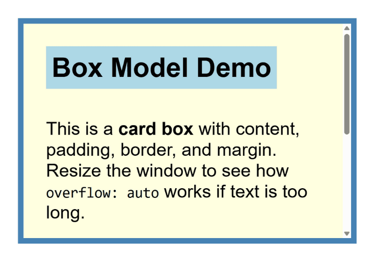
In the first view, you can see the card box with content, padding, border, and margin. Since the text is longer than the fixed height, part of it is hidden.
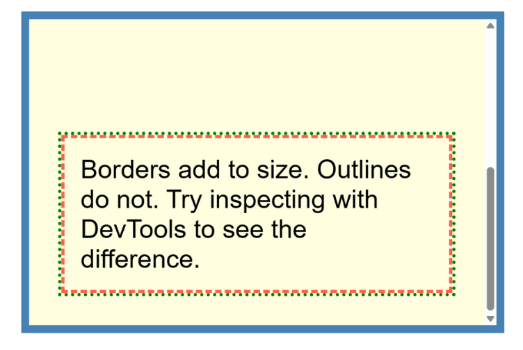
When you scroll inside the box (second screenshot), the hidden content appears and a scrollbar shows up because of overflow: auto;. This way, the content stays inside the same box without breaking the layout.

