Clean • Professional
CSS alignment is essential for creating visually appealing, professional, and readable web pages. Proper alignment ensures elements are placed consistently, improving both aesthetics and user experience. With modern CSS, alignment has become more flexible and easier to manage using Flexbox, Grid, and traditional methods.
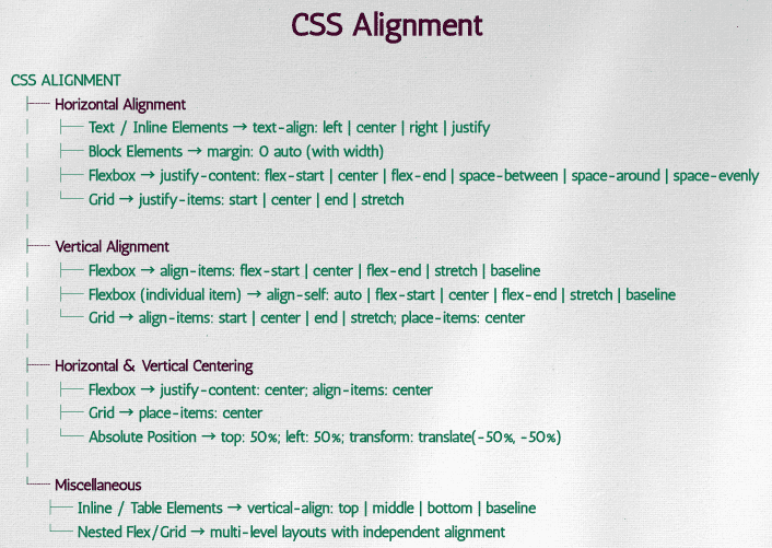
Horizontal alignment deals with placing elements left, center, or right within their container. There are several ways to achieve this:
Using text-align (for inline content)
justify spreads the text evenly across the width of the container.p {
text-align: center; /* left | center | right | justify */
}
<div class="text-box">
  <p>This text is centered.</p>
</div>
.container {
  display: flex;
  justify-content: space-around;  /* flex-start | flex-end | center | space-between | space-around | space-evenly */
}
<div class="flex-container">
  <div>One</div>
  <div>Two</div>
  <div>Three</div>
</div>
Using margin: auto for block elements centers a block-level element horizontally within its container by automatically adjusting the left and right margins. It works only when the element has a defined width.
.container {
  width: 100%;
}
.box {
  width: 200px;
  margin: 0 auto; /* Centers horizontally */
  background: lightblue;
  text-align: center;
}
<div class="container">
  <div class="box">Centered Box</div>
</div>
Vertical alignment places elements top, middle, or bottom of their container. CSS provides modern ways to handle this:
Using Flexbox
align-items: center vertically centers all items in the container.
.flex-vertical {
  display: flex;
  align-items: center; /* flex-start | flex-end | center | stretch | baseline */
  height: 200px;
  background: #eee;
}
<div class="flex-vertical">
  <div>Aligned Center</div>
</div>
Using Grid
Grid provides a concise way to center both horizontally and vertically.
.container {
  display: grid;
  place-items: center; /* shorthand for justify-items + align-items */
  height: 200px;
  background: #f2f2f2;
}
<div class="container">
  <div>Centered with Grid</div>
</div>
Using Line-Height (for single-line text)
Simple but limited to single-line text.
p {
  line-height: 200px; /* same as container height */
  text-align: center;
  background: #fafafa;
}
<div style="height:200px; background:#eee;">
  <p>Vertically Centered Text</p>
</div>
Centering is one of the most common alignment tasks:
Horizontal & Vertical with Flexbox
Set display: flex on the container, then use justify-content: center and align-items: center to center elements horizontally and vertically.
.container {
  display: flex;
  justify-content: center;
  align-items: center;
  height: 300px;
  background: #ddd;
}
<div class="container">
  <div>Centered with Flexbox</div>
</div>
Absolute Positioning
Works for elements with known or dynamic sizes.
.parent {
  position: relative;
  height: 300px;
  background: #eee;
}
.child {
  position: absolute;
  top: 50%;
  left: 50%;
  transform: translate(-50%, -50%);
}
<div class="parent">
  <div class="child">Centered with Absolute Position</div>
</div>
vertical-align helps align table cells and inline elements.
img {
  vertical-align: middle; /* top | middle | bottom | baseline */
}
<p>
  Text before
  <img src="image.png" alt="icon" height="20">
  Text after
</p>
justify-content → Horizontal distribution in Flexbox/Grid.align-items → Vertical alignment in Flexbox/Grid.align-self → Override vertical alignment for individual items.place-items → Shorthand for aligning items in Grid.place-content → Aligns entire grid content inside container.