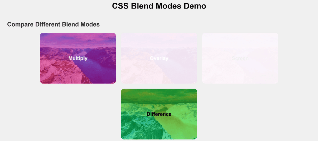
When designing modern websites, images and colors often need to interact visually with each other. Instead of just stacking them, CSS provides a powerful feature called blend modes.
Blend modes decide how the top layer blends with the background layer — creating effects similar to Photoshop. With just one CSS property, you can make colors look darker, lighter, transparent, or even create artistic effects.
What is a CSS Blend Mode?
A blend mode is applied when two elements (or layers) overlap. The browser calculates how the colors of the foreground (top element) should mix with the background (underneath element).
In CSS, we use the property:
mix-blend-mode: value;Common CSS Blend Modes
Multiply
- Effect: Darkens the image by multiplying base color with blend color.
- Use Case: Perfect for dark overlays, shading effects, and blending images with solid colors.
Example: Adding a dark tone to a hero section background.
.multiply-demo {
  background: url("image.jpg") center/cover no-repeat;
  mix-blend-mode: multiply;
}
Overlay
- Effect: Combines multiply and screen modes. It makes dark areas darker and light areas lighter.
- Use Case: Great for making images look more vibrant and contrasty.
Example: Textured backgrounds on banners or posters.
.overlay-demo {
  background: url("image.jpg") center/cover no-repeat;
  mix-blend-mode: overlay;
}
Screen
- Effect: Opposite of multiply — it lightens the image by blending colors with brightness.
- Use Case: Used for glowing effects, highlights, or making dark images more visible.
- Example: Adding light overlays, fireflies, or dreamy effects.
.screen-demo {
  background: url("image.jpg") center/cover no-repeat;
  mix-blend-mode: screen;
}
Difference
- Effect: Subtracts color values, creating a high-contrast inverted effect.
- Use Case: Great for artistic designs, hover effects, or funky backgrounds.
.difference-demo {
  background: url("image.jpg") center/cover no-repeat;
  mix-blend-mode: difference;
}
Why Use Blend Modes in CSS?
- Reduce dependency on Photoshop/Illustrator for image editing
- Lightweight and easy to apply with pure CSS
- Works dynamically with hover states, gradients, and animations
- Adds creativity and professionalism to web design
Common CSS Blend Modes Example :
<!DOCTYPE html>
<html lang="en">
<head>
  <meta charset="UTF-8">
  <meta name="viewport" content="width=device-width, initial-scale=1.0">
  <title>CSS Blend Modes Demo</title>
  <style>
    body {
      font-family: Arial, sans-serif;
      background: #f0f0f0;
      padding: 20px;
    }

    h1 {
      text-align: center;
      margin-bottom: 40px;
    }

    h2 {
      margin-top: 40px;
      color: #333;
    }

    .blend-container {
      display: flex;
      flex-wrap: wrap;
      gap: 20px;
      justify-content: center;
    }

    .blend-box {
      width: 300px;
      height: 200px;
      position: relative;
      border-radius: 12px;
      overflow: hidden;
      display: flex;
      align-items: center;
      justify-content: center;
      color: #fff;
      font-weight: bold;
      text-align: center;
      font-size: 20px;
    }

    /* Base image overlay with different blend modes */
    .multiply-demo {
      background: url("<https://picsum.photos/id/1015/400/300>") center/cover no-repeat;
      mix-blend-mode: multiply;
    }

    .overlay-demo {
      background: url("<https://picsum.photos/id/1015/400/300>") center/cover no-repeat;
      mix-blend-mode: overlay;
    }

    .screen-demo {
      background: url("<https://picsum.photos/id/1015/400/300>") center/cover no-repeat;
      mix-blend-mode: screen;
      color: #000;
    }

    .difference-demo {
      background: url("<https://picsum.photos/id/1015/400/300>") center/cover no-repeat;
      mix-blend-mode: difference;
    }

    /* Optional: colored overlay to better show blend effect */
    .blend-box::before {
      content: '';
      position: absolute;
      inset: 0;
      background: rgba(255, 0, 150, 0.5); /* pink overlay */
      z-index: 1;
    }

    .blend-box span {
      position: relative;
      z-index: 2;
    }

  </style>
</head>
<body>

  <h1>CSS Blend Modes Demo</h1>

  <h2>Compare Different Blend Modes</h2>
  <div class="blend-container">

    <div class="blend-box multiply-demo">
      <span>Multiply</span>
    </div>

    <div class="blend-box overlay-demo">
      <span>Overlay</span>
    </div>

    <div class="blend-box screen-demo">
      <span>Screen</span>
    </div>

    <div class="blend-box difference-demo">
      <span>Difference</span>
    </div>

  </div>

</body>
</html>
Output :


