Clean • Professional
CSS Grid is not just about creating rows and columns—it has advanced features that allow for highly flexible and complex layouts. In this guide, we’ll cover subgrid, nested grids, and responsive design with Grid, along with practical examples.
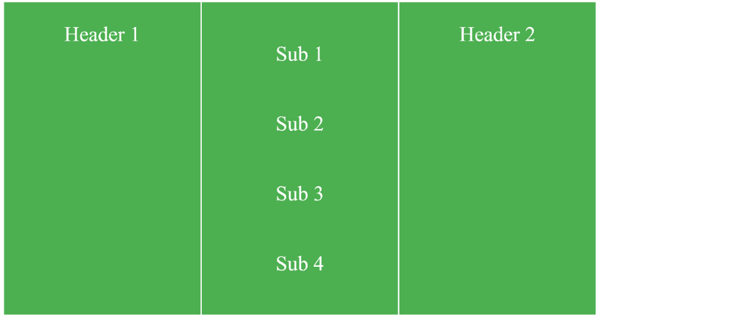
The subgrid feature allows a child grid to inherit the row or column structure of its parent grid. This is useful when you want inner items to align perfectly with the main grid.
<div class="parent-grid">
  <div class="item">Header 1</div>
  <div class="item">
    <div class="child-grid">
      <div>Sub 1</div>
      <div>Sub 2</div>
      <div>Sub 3</div>
      <div>Sub 4</div>
    </div>
  </div>
  <div class="item">Header 2</div>
</div>
.parent-grid {
  display: grid;
  grid-template-columns: 150px 150px 150px;
  gap: 1px;
}

.child-grid {
  display: grid;
  grid-template-columns: subgrid; /* inherits columns from parent */
  gap: 5px;
}

.parent-grid .item, .child-grid div {
  background: #4CAF50;
  color: white;
  text-align: center;
  padding: 15px;
}
Output :

Nested grids are grids inside grids. Unlike subgrid, nested grids can have independent structure, which is useful for creating complex layouts like cards or dashboards.
<div class="outer-grid">
  <div class="card">
    <div class="inner-grid">
      <div>Title</div>
      <div>Content</div>
      <div>Footer</div>
    </div>
  </div>
  <div class="card">Another Card</div>
</div>
.outer-grid {
  display: grid;
  grid-template-columns: repeat(2, 200px);
  gap: 2px;
}

.inner-grid {
  display: grid;
  grid-template-rows: auto 1fr auto;
  gap: 10px;
  background: #FF9800;
  padding: 10px;
  color: white;
}

.outer-grid .card {
  background: #673AB7;
  padding: 10px;
  color: white;
}
Output :

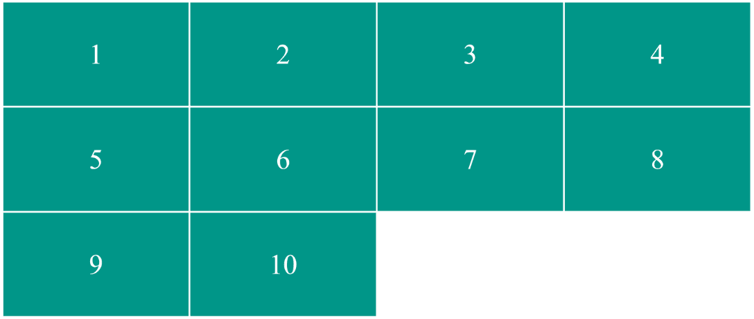
CSS Grid is perfect for responsive layouts. Using repeat(), minmax(), and fractional units (fr), you can create grids that adapt to screen size automatically.
<div class="responsive-grid">
  <div>1</div>
  <div>2</div>
  <div>3</div>
  <div>4</div>
  <div>5</div>
  <div>6</div>
  <div>7</div>
  <div>8</div>
  <div>9</div>
  <div>10</div>
</div>
.responsive-grid {
  display: grid;
  grid-template-columns: repeat(auto-fit, minmax(100px, 1fr));
  gap: 1px;
}

.responsive-grid div {
  background: #009688;
  color: white;
  text-align: center;
  padding: 20px 0;
}
Output :
