Clean • Professional
drop-shadow()The drop-shadow() function is part of the CSS filter property. Unlike box-shadow, which creates a shadow around a rectangular element, drop-shadow() follows the shape of the element, including images with transparency or SVGs. It’s commonly used for images, icons, or shapes to give a realistic shadow effect.
filter: drop-shadow(offset-x offset-y blur-radius color);
Parameters:
| Parameter | Description |
|---|---|
offset-x | Horizontal distance of the shadow (positive → right, negative → left) |
offset-y | Vertical distance of the shadow (positive → down, negative → up) |
blur-radius | Softens the edges of the shadow (optional, default is 0) |
color | Shadow color (optional, default is black) |
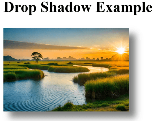
<h2>Drop Shadow Example</h2>
<img src="<https://img.freepik.com/premium-photo/best-amazing-wonderful-this-photo-take-this-picture-your-work-ai-generated-top-lovely-photo_1169327-87093.jpg>" alt="Sample Image" class="shadow-img">
 .shadow-img {
      width: 200px;
      filter: drop-shadow(10px 10px 5px rgba(0,0,0,0.5));
    }
Output :

drop-shadow() is perfect for images with transparent backgrounds (like PNGs or SVGs), because the shadow will only follow the visible shape, not the rectangular bounding box.
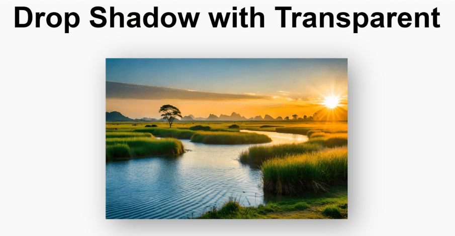
<h2>Drop Shadow with Transparent</h2>
<img src="<https://img.freepik.com/premium-photo/best-amazing-wonderful-this-photo-take-this-picture-your-work-ai-generated-top-lovely-photo_1169327-87093.jpg>" alt="Sample Image" class="transparent-img">
body {
      background: #f9f9f9;
      text-align: center;
      padding: 50px;
      font-family: Arial, sans-serif;
    }

    .transparent-img {
      width: 200px;
      filter: drop-shadow(5px 5px 10px rgba(0,0,0,0.4));
    }
Output :

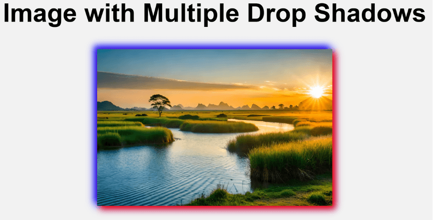
You can apply more than one drop-shadow using multiple drop-shadow() functions:
<h2>Image with Multiple Drop Shadows</h2>
<img src="<https://img.freepik.com/premium-photo/best-amazing-wonderful-this-photo-take-this-picture-your-work-ai-generated-top-lovely-photo_1169327-87093.jpg>" alt="Sample Image">
img {
     width: 220px;
     filter: drop-shadow(3px 3px 3px red)
              drop-shadow(-3px -3px 3px blue);
    }
Output :

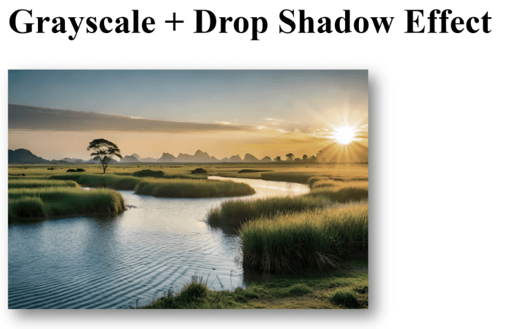
drop-shadow() can be combined with other CSS filters like blur(), grayscale(), brightness(), etc.:
<h2>Grayscale + Drop Shadow Effect</h2>
<img src="<https://img.freepik.com/premium-photo/best-amazing-wonderful-this-photo-take-this-picture-your-work-ai-generated-top-lovely-photo_1169327-87093.jpg>" alt="Sample Image">
  img {
      width: 250px;
      filter: grayscale(50%) drop-shadow(5px 5px 5px rgba(0,0,0,0.5));
    }
Output :
