Clean • Professional
Normally, when we use background-color in CSS, we can only apply one solid color. But with CSS gradients, you can smoothly blend two or more colors together — without needing any image files.
Think of gradients as color transitions that you can control in different directions, shapes, and patterns.
Linear Gradient
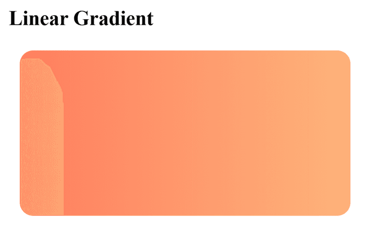
Colors blend along a straight line (top-to-bottom, left-to-right, diagonal, etc.).
Example : Smooth transition from peach-orange to light-orange (left to right)..
<!DOCTYPE html>
<html>
<head>
  <style>
    .linear-box {
      width: 300px;
      height: 150px;
      background: linear-gradient(to right, #ff7e5f, #feb47b);
      border-radius: 12px;
      margin: 10px;
    }
  </style>
</head>
<body>
  <h3>Linear Gradient</h3>
  <div class="linear-box"></div>
</body>
</html>
Output :

Radial Gradient
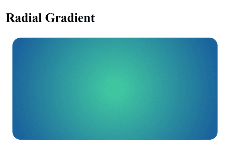
Colors spread out from the center (or a defined point) in a circular/elliptical shape.
Example : A green-to-blue glowing circle effect.
<!DOCTYPE html>
<html>
<head>
  <style>
    .radial-box {
      width: 300px;
      height: 150px;
      background: radial-gradient(circle, #43cea2, #185a9d);
      border-radius: 12px;
      margin: 10px;
    }
  </style>
</head>
<body>
  <h3>Radial Gradient</h3>
  <div class="radial-box"></div>
</body>
</html>
Output :

Conic Gradient
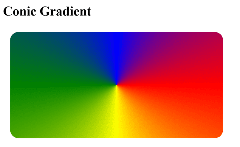
Colors are placed around a circle, like a color wheel.
Example : Colors spread in a circular wheel pattern.
<!DOCTYPE html>
<html>
<head>
  <style>
    .conic-box {
      width: 300px;
      height: 150px;
      background: conic-gradient(from 90deg, red, yellow, green, blue, red);
      border-radius: 12px;
      margin: 10px;
    }
  </style>
</head>
<body>
  <h3>Conic Gradient</h3>
  <div class="conic-box"></div>
</body>
</html>
