Clean • Professional
When we design modern websites, we often need to style elements not only based on their structure but also based on their state, user interaction, or position in the DOM. That’s exactly where CSS pseudo-classes are super useful.
A pseudo-class is a keyword added to a selector that defines a special state of an element. It allows you to apply styles dynamically — for example, when a user hovers over a button, focuses on an input field, or when an element is the first or nth child of its parent.
They improve interactivity (hover effects, focus styles, active states).
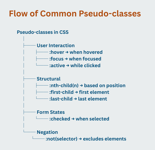
:hover – When User Points at an Element
Example:
button:hover {
  background-color: #007BFF;
  color: #fff;
}
:focus – When an Element Gains Focus
Example:
input:focus {
  border: 2px solid blue;
  outline: none;
}
:active – While Element is Being Clicked
Example:
a:active {
  color: red;
}
:nth-child() – Target Elements Based on Position
even, odd, or custom (2n+1) patterns.Example:
li:nth-child(odd) {
  background: #f2f2f2;
}
:first-child and :last-child
:first-child → Styles the first element inside a parent.:last-child → Styles the last element inside a parent.Example:
p:first-child {
  font-weight: bold;
}
p:last-child {
  color: gray;
}
:checked – For Form Inputs
Example:
input[type="checkbox"]:checked {
  accent-color: green;
}
:not() – Negation Pseudo-class
Example:
p:not(.highlight) {
color: black;
}

| Pseudo-class | Example | Description |
|---|---|---|
:active | a:active | Selects the link while it is being clicked (active state). |
:any-link | a:any-link, area:any-link | Selects any <a> or <area> element with an href attribute (both visited and unvisited links). |
:autofill | input:autofill | Selects input elements that are auto-filled by the browser. |
:checked | input:checked, option:checked | Selects checked form elements like radio buttons, checkboxes, or selected options. |
:default | input:default, button:default, option:default | Selects the default element in a group (like default option in a dropdown). |
:defined | :defined | Matches elements that are defined (standard HTML elements or custom web components). |
:dir() | :dir(ltr), :dir(rtl) | Selects elements based on text direction (left-to-right or right-to-left). |
:disabled | input:disabled, option:disabled | Selects disabled form fields (unusable). |
:empty | div:empty | Selects elements that have no children or text. |
:enabled | input:enabled | Selects enabled form fields. |
:first | @page :first | Applies styles to the first page of a printed document. |
:first-child | p:first-child | Selects an element if it is the first child of its parent. |
:first-of-type | p:first-of-type | Selects the first element of its type among siblings. |
:focus | input:focus | Selects an element when it gains focus (clicked or tabbed into). |
:focus-visible | button:focus-visible | Selects focused elements only when triggered by keyboard, not mouse. |
:focus-within | form:focus-within | Selects a parent element if it or any of its descendants are focused. |
:fullscreen | :fullscreen | Matches elements currently in fullscreen mode. |
:has() | h2:has(+p) | Selects elements that contain specific children or are followed by certain elements. |
:hover | a:hover, p:hover | Applies styles when a user hovers over an element with the mouse. |
:in-range | input:in-range | Selects inputs with values inside the allowed range. |
:indeterminate | input:indeterminate | Selects form elements in an indeterminate state (like a checkbox that is neither checked nor unchecked). |
:invalid | input:invalid | Selects form fields with invalid values. |
:is() | :is(ul, ol) | Simplifies selectors by grouping multiple element types. |
:lang() | p:lang(it) | Selects elements with a specific language attribute. |
:last-child | li:last-child | Selects the last child of a parent element. |
:last-of-type | p:last-of-type | Selects the last element of a specific type. |
:left | @page :left | Applies styles to left-hand pages when printing. |
:link | a:link | Selects unvisited links. |
:modal | :modal | Selects elements in modal (dialog) state. |
:not() | :not(p) | Selects all elements except <p>. |
:nth-child() | p:nth-child(2) | Selects the second child of a parent. |
:nth-last-child() | p:nth-last-child(2) | Selects the second child from the end. |
:nth-last-of-type() | p:nth-last-of-type(2) | Selects the second occurrence of an element type from the end. |
:nth-of-type() | p:nth-of-type(2) | Selects the second <p> element among siblings. |
:only-child | p:only-child | Selects elements that are the only child of a parent. |
:only-of-type | p:only-of-type | Selects elements that are the only of their type within a parent. |
:optional | input:optional | Selects form fields that are not required. |
:out-of-range | input:out-of-range | Selects inputs with values outside the allowed range. |
:placeholder-shown | input:placeholder-shown | Selects inputs or textareas currently showing placeholder text. |
:popover-open | :popover-open | Selects elements currently displaying as a popover. |
:read-only | input:read-only | Selects inputs that cannot be edited. |
:read-write | input:read-write | Selects editable input fields. |
:required | input:required | Selects required form fields. |
:right | @page :right | Applies styles to right-hand pages when printing. |
:root | :root | Selects the root of the document (usually <html>). |
:scope | :scope | Defines the current scope for selectors (useful in nested queries). |
:state() | :state(custom) | Selects custom elements in a defined state. |
:target | :target | Selects the element with an id matching the current URL hash. |
:user-invalid | :user-invalid | Matches invalid form elements after user interaction. |
:user-valid | :user-valid | Matches valid form elements after user interaction. |
:valid | input:valid | Selects valid form elements. |
:visited | a:visited | Selects visited links. |
:where() | :where(ul, ol) | Similar to :is(), but with lower specificity. |