Clean • Professional
The CSS filter property is one of the most powerful tools in modern web design. It allows developers to apply visual effects like blur, brightness, grayscale, contrast, hue-rotate, and more directly to images, text, and even entire sections of a webpage — without editing the original files in Photoshop or other tools.
Using filters can make a website look modern, creative, and engaging, while also improving user experience.
selector {
  filter: filter-function(value);
}
Below are the most used filters in CSS along with HTML + CSS examples you can try in your projects.
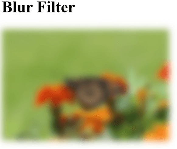
The blur filter makes the element look out of focus.
<h2>Blur Filter</h2>
<img src="<https://images.pexels.com/photos/1212693/pexels-photo-1212693.jpeg?cs=srgb&dl=pexels-katie-burandt-1212693.jpg&fm=jpg>" alt="Blur Image" class="blur-img">
.blur-img {
  width: 250px;
  filter: blur(5px);
}
Output :
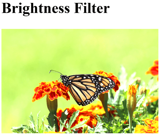
The brightness filter controls how light or dark an element looks.
<img src="image.jpg" alt="Brightness Example" class="bright-img">
.bright-img {
  width: 250px;
  filter: brightness(150%);
}
Output :
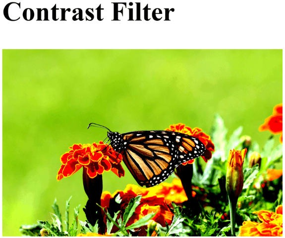
The contrast filter adjusts the difference between light and dark areas of an image.
<img src="image.jpg" alt="Contrast Example" class="contrast-img">
.contrast-img {
  width: 250px;
  filter: contrast(200%);
}
Output :
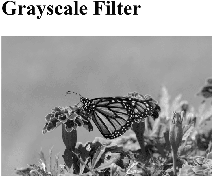
Converts an element into black & white tones.
<img src="image.jpg" alt="Grayscale Example" class="gray-img">
.gray-img {
  width: 250px;
  filter: grayscale(100%);
}
Output :
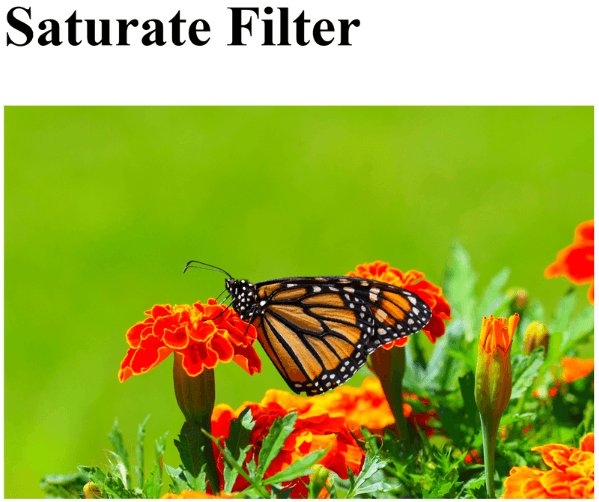
The saturate filter controls the intensity of colors.
<img src="image.jpg" alt="Saturate Example" class="saturate-img">
.saturate-img {
  width: 250px;
  filter: saturate(200%);
}
Output :
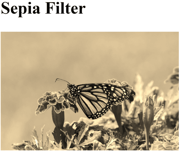
Applies a warm brown tone to the image, like an old photograph.
<img src="image.jpg" alt="Sepia Example" class="sepia-img">
.sepia-img {
  width: 250px;
  filter: sepia(100%);
}
Output :
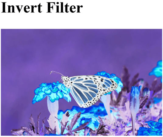
The invert filter flips colors to their opposite values, similar to a negative photo effect.
<img src="image.jpg" alt="Invert Example" class="invert-img">
.invert-img {
  width: 250px;
  filter: invert(100%);
}
Output :
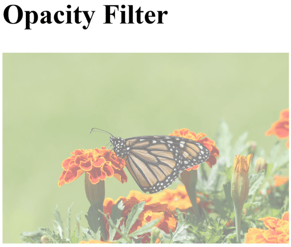
Controls the transparency of an element.
<img src="image.jpg" alt="Opacity Example" class="opacity-img">
.opacity-img {
  width: 250px;
  filter: opacity(50%);
}
Output :
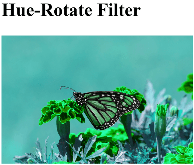
The hue-rotate filter rotates all the colors in the image around the color wheel.
<img src="image.jpg" alt="Hue Rotate Example" class="hue-img">
.hue-img {
  width: 250px;
  filter: hue-rotate(90deg);
}
Output :
