Clean • Professional
CSS Grid is a two-dimensional layout system in CSS. Unlike Flexbox, which works in one direction (row or column), CSS Grid lets you align items in both rows and columns simultaneously. This makes it ideal for creating:
With CSS Grid, you can design layouts without using floats or manual positioning, reducing extra wrapper elements and making your HTML cleaner.
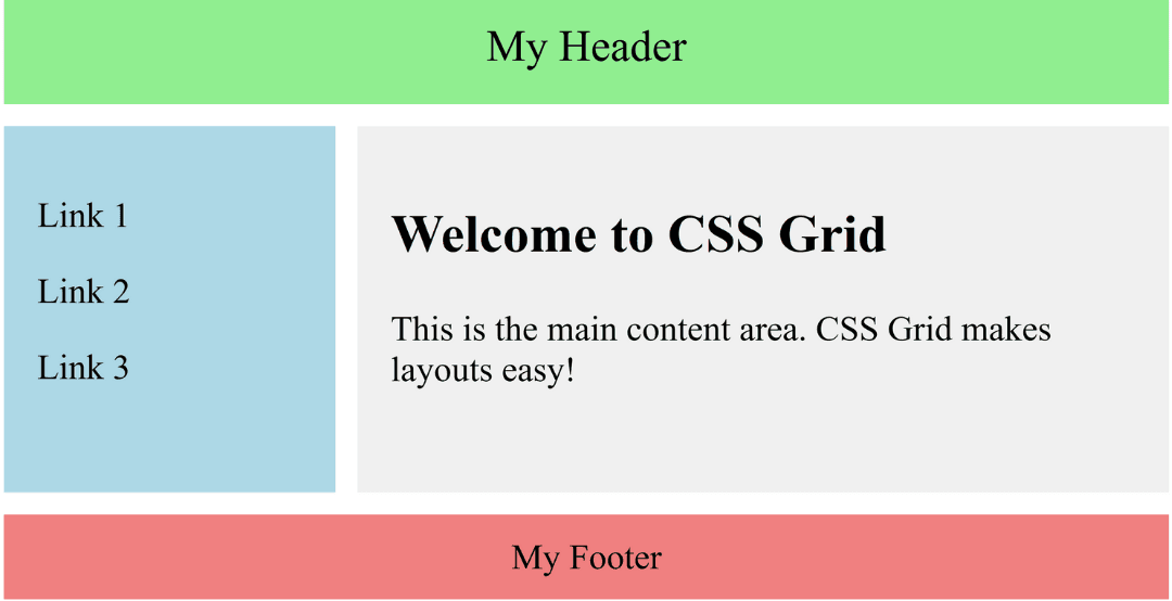
The CSS Grid Layout Module is a modern way to design web pages. It helps you create clean, flexible, and responsive layouts using rows and columns—without using floats or tricky positioning.With Grid, you can easily build page parts like headers, sidebars, content areas, and footers. It works in all modern browsers, which makes it one of the most useful tools for web developers today.
<!DOCTYPE html>
<html lang="en">
<head>
  <meta charset="UTF-8">
  <meta name="viewport" content="width=device-width, initial-scale=1.0">
  <title>Simple CSS Grid Example</title>
  <style>
    .grid-container {
      display: grid; /* turns this div into a grid */
      grid-template-columns: 150px 1fr; /* 2 columns: 150px sidebar + flexible main area */
      grid-template-rows: auto 1fr auto; /* 3 rows: header, content, footer */
      grid-template-areas:
        "header header"
        "sidebar main"
        "footer footer";
      gap: 10px; /* space between grid items */
      height: 100vh;
    }

    header {
      grid-area: header;
      background: lightgreen;
      padding: 15px;
      text-align: center;
      font-size: 20px;
    }

    nav {
      grid-area: sidebar;
      background: lightblue;
      padding: 15px;
    }

    main {
      grid-area: main;
      background: #f0f0f0;
      padding: 15px;
    }

    footer {
      grid-area: footer;
      background: lightcoral;
      text-align: center;
      padding: 10px;
    }
  </style>
</head>
<body>
  <div class="grid-container">
    <header>My Header</header>

    <nav>
      <p>Link 1</p>
      <p>Link 2</p>
      <p>Link 3</p>
    </nav>

    <main>
      <h2>Welcome to CSS Grid</h2>
      <p>This is the main content area. CSS Grid makes layouts easy!</p>
    </main>

    <footer>My Footer</footer>
  </div>
</body>
</html>
Output :

Two-dimensional layouts – Handles rows and columns together.
fr units, minmax(), and media queries.| Feature | CSS Grid | CSS Flexbox |
|---|---|---|
| Dimensions | Two-dimensional (rows + columns) | One-dimensional (row OR column) |
| Best Use Case | Complex layouts | Simple layouts, navbars, cards |
| Control | Full control of rows and columns | Control along a single axis |
CSS Grid is widely used in modern web development. Common scenarios include:
Grid Container – The parent element with display: grid or inline-grid.
Example:
<h2>CSS Grid Components Example</h2>

  <div class="grid-container">
    <div class="grid-item">1</div>
    <div class="grid-item">2</div>
    <div class="grid-item">3</div>
    <div class="grid-item">4</div>
    <div class="grid-item">5</div>
    <div class="grid-item">6</div>
</div>.grid-container {
display: grid; /* turns this div into a grid container */
grid-template-columns: 1fr 1fr 1fr; /* 3 equal columns */
gap: 10px; /* spacing between grid items */
padding: 10px;
background-color: #f4f4f4;
}
.grid-item {
background-color: #4caf50;
color: white;
font-size: 20px;
text-align: center;
padding: 20px;
border-radius: 8px;
}Output :

A container becomes a grid container only when its display property is set to grid or inline-grid.
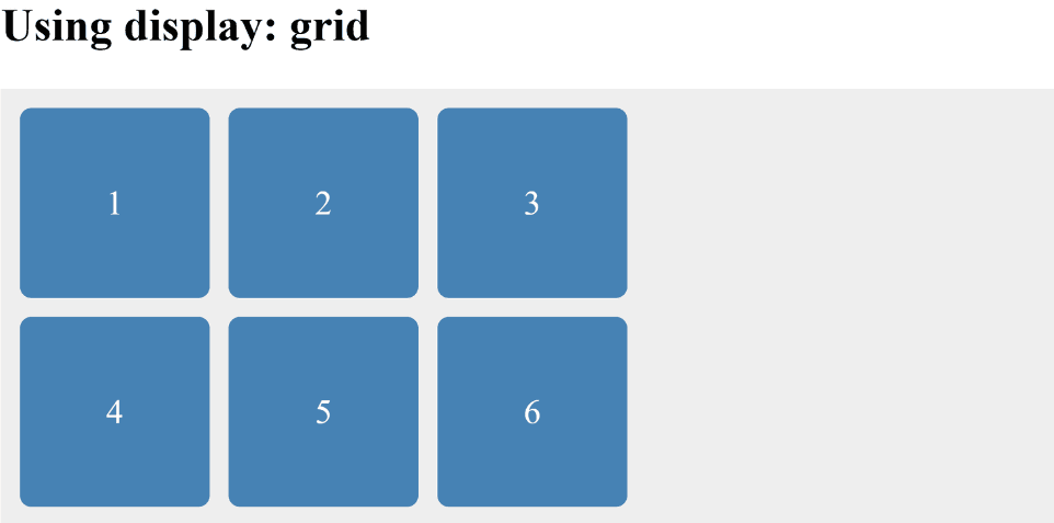
display: gridgrid-template-columns, grid-template-rows, gap.Example:
<h2>Using display: grid</h2>

  <div class="grid-container">
    <div class="grid-item">1</div>
    <div class="grid-item">2</div>
    <div class="grid-item">3</div>
    <div class="grid-item">4</div>
    <div class="grid-item">5</div>
    <div class="grid-item">6</div>
</div>.grid-container {
display: grid; /* activates grid */
grid-template-columns: 100px 100px 100px; /* 3 fixed columns */
grid-template-rows: 100px 100px; /* 2 fixed rows */
gap: 10px; /* space between cells */
background-color: #eee;
padding: 10px;
}
.grid-item {
background-color: steelblue;
color: white;
font-size: 18px;
text-align: center;
line-height: 100px; /* vertically center text */
border-radius: 6px;
}Output :

display: inline-gridExample :
<h2>Using display: inline-grid;</h2>

  <div class="inline-grid-container">
    <div class="grid-item">1</div>
    <div class="grid-item">2</div>
    <div class="grid-item">3</div>
  </div>

  <div class="inline-grid-container">
    <div class="grid-item">A</div>
    <div class="grid-item">B</div>
    <div class="grid-item">C</div>
</div>.inline-grid-container {
display: inline-grid; /* inline-level grid */
grid-template-columns: 80px 80px 80px; /* 3 columns */
gap: 5px;
background-color: #f0f0f0;
padding: 10px;
margin: 10px;
border: 2px solid #333;
}
.grid-item {
background-color: crimson;
color: white;
text-align: center;
padding: 20px;
border-radius: 6px;
}Output :

| Property | Description |
|---|---|
display | Defines the container as grid or inline-grid. |
grid-template-columns | Sets the number and size of columns. |
grid-template-rows | Sets the number and size of rows. |
grid-template-areas | Assigns named areas for easier placement of items. |
grid-gap / gap | Sets spacing between rows and columns. |
row-gap / column-gap | Sets spacing for rows or columns individually. |
grid-auto-rows / grid-auto-columns | Default size for automatically created rows/columns. |
grid-auto-flow | Controls how items are auto-placed in the grid. |
grid-area | Assigns an item to a named grid area. |
justify-content | Horizontally aligns the entire grid inside the container. |
align-content | Vertically aligns the entire grid inside the container. |
justify-items | Horizontally aligns items within their grid cells. |
align-items | Vertically aligns items within their grid cells. |
justify-self | Aligns a specific item horizontally. |
align-self | Aligns a specific item vertically. |
place-items | Shorthand for align-items + justify-items. |
place-content | Shorthand for align-content + justify-content. |
grid-column / grid-row | Shorthand for specifying start and end positions. |