Clean • Professional
Flexbox (Flexible Box Layout) is a modern CSS layout system that makes designing web pages easier and more responsive. It helps arrange, align, and space items inside a container—even if their size changes.
Unlike floats or tables, Flexbox works in one direction at a time:
This makes it great for menus, cards, forms, and responsive layouts.
Example:
.container {
  display: flex;
}
.item {
  background: lightblue;
  padding: 20px;
  margin: 10px;
}
<div class="container">
  <div class="item">Box 1</div>
  <div class="item">Box 2</div>
  <div class="item">Box 3</div>
</div>
Output :

Earlier, developers used floats, inline-block, and tables for layouts, but they had problems:
Flexbox makes it easy to build horizontal menus that stay centered and spaced evenly across any screen.
nav {
  display: flex;
  justify-content: space-between;
}
<nav>
  <a href="#">Home</a>
  <a href="#">About</a>
  <a href="#">Contact</a>
</nav>
Output :

Perfect for product listings, blogs, or dashboards where cards adjust dynamically.
.cards {
  display: flex;
  gap: 10px;
}
.card {
  flex: 1;
  background: #f4f4f4;
  padding: 20px;
}
<div class="cards">
  <div class="card">Card 1</div>
  <div class="card">Card 2</div>
  <div class="card">Card 3</div>
</div>
Output :

Aligning images beside text blocks becomes straightforward.
.media {
  display: flex;
  align-items: center;
}
.media img {
  width: 20px;
  margin-right: 10px;
}
<div class="media">
  <img src="checkedmark.png" alt="Sample">
  <p>Text beside the image</p>
</div>
Output :
_20250917_063029.png&w=3840&q=75)
Input fields, labels, and buttons align perfectly without extra code.
form {
  display: flex;
  gap: 10px;
}
<form>
  <input type="text" placeholder="Name">
  <button>Submit</button>
</form>
Output :

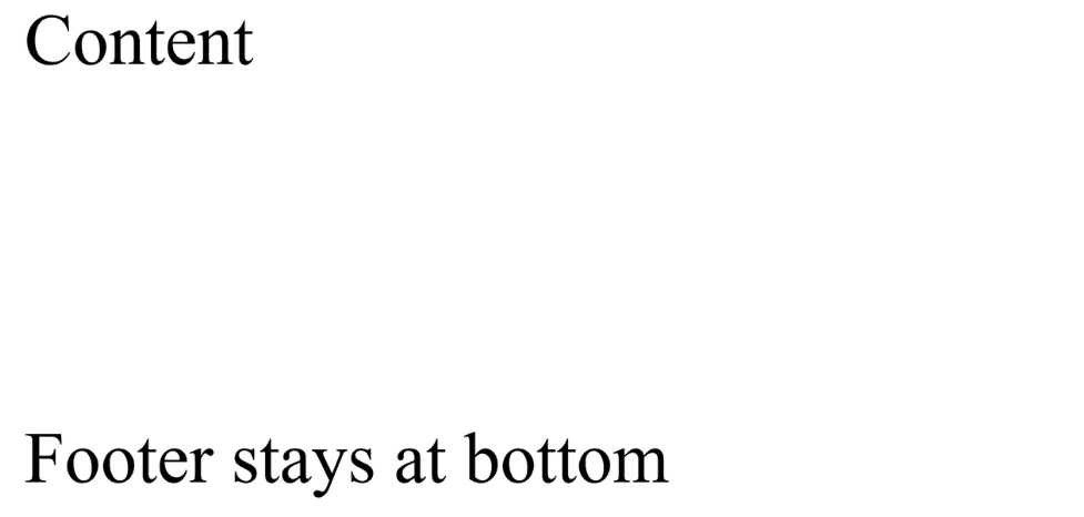
Ensure that footers stay at the bottom of the page even when content is short.
body {
  display: flex;
  flex-direction: column;
  min-height: 50vh;
}
main {
  flex: 1;
}
<body>
  <main>Content</main>
  <footer>Footer stays at bottom</footer>
</body>
Output :
