Clean • Professional
Links are a key part of every website. They connect pages, guide users, and make navigation easy. By default, links appear blue and underlined, but with CSS you can style them in creative ways to match your design and improve user experience.
A link (anchor tag <a>) is a clickable element that takes users to another webpage, section, or external resource. They are the backbone of web navigation.
Example:
<a href="<https://example.com>">Visit Example</a>
CSS allows you to control the color, size, background, borders, spacing, and hover effects of links. Instead of looking plain, links can be turned into engaging UI elements that guide the user effectively.
Links have different states that can be styled individually:
Example:
a:link {
  color: blue;
}

a:visited {
  color: purple;
}

a:hover {
  color: red;
  text-decoration: underline;
}

a:active {
  color: orange;
}
By default, links are underlined. You can remove or customize this underline using text-decoration.
Example:
a {
  text-decoration: none;
}

a:hover {
  text-decoration: underline dashed;
}
Links don’t need to be just text. Adding background colors makes them stand out more.
Example:
a {
  background-color: yellow;
  color: black;
  padding: 5px;
}
On hover, you can change the background for better interactivity:
a:hover {
  background-color: orange;
  color: white;
}
You can style links to look like modern buttons, making them perfect for CTAs (Call to Action).
Example:
a.button {
  display: inline-block;
  padding: 10px 20px;
  background: #3498db;
  color: #fff;
  text-decoration: none;
  border-radius: 5px;
  transition: background 0.3s;
}

a.button:hover {
  background: #2980b9;
}
Sometimes, instead of text, you can use images as links. This is useful for clickable logos, banners, or product images.
Example:
<a href="<https://example.com>">
  <img src="logo.png" alt="Example Logo" width="200">
</a>
Here are a few creative ideas:
a {
  color: white;
  text-shadow: 0 0 5px #ff0000, 0 0 10px #ff0000;
}
a {
  position: relative;
  text-decoration: none;
}

a::after {
  content: '';
  position: absolute;
  width: 100%;
  height: 2px;
  background: red;
  left: 0;
  bottom: -2px;
  transform: scaleX(0);
  transition: transform 0.3s;
}

a:hover::after {
  transform: scaleX(1);
}
a {
  padding: 8px 16px;
  border: 2px solid #333;
  border-radius: 25px;
}
If you don’t style them with CSS, browsers apply default link styles:
<!DOCTYPE html>
<html lang="en">
<head>
  <meta charset="UTF-8">
  <meta name="viewport" content="width=device-width, initial-scale=1.0">
  <title>CSS Links and Hover Effects</title>
  <style>
    body {
      font-family: Arial, sans-serif;
      padding: 20px;
    }

    h2 {
      margin-top: 40px;
    }

    /* 1. CSS Links: normal, visited, hover, active */
    a:link {
      color: #3498db;
      text-decoration: none;
    }

    a:visited {
      color: #8e44ad;
    }

    a:hover {
      color: #e74c3c;
      text-decoration: underline;
    }

    a:active {
      color: #27ae60;
    }

    /* 2. Hover Effects & Transitions */
    .button-link {
      display: inline-block;
      margin-top: 20px;
      background: #3498db;
      color: white;
      padding: 10px 20px;
      border-radius: 25px;
      text-decoration: none;
      transition: all 0.3s ease;
    }

    .button-link:hover {
      background: #2980b9;
      transform: scale(1.1);
      box-shadow: 0 4px 8px rgba(0,0,0,0.2);
    }

    .underline-animate {
      position: relative;
      color: #2c3e50;
      text-decoration: none;
      transition: color 0.3s;
    }

    .underline-animate::after {
      content: "";
      position: absolute;
      left: 0;
      bottom: -3px;
      width: 100%;
      height: 2px;
      background: #e74c3c;
      transform: scaleX(0);
      transform-origin: right;
      transition: transform 0.3s ease;
    }

    .underline-animate:hover {
      color: #e74c3c;
    }

    .underline-animate:hover::after {
      transform: scaleX(1);
      transform-origin: left;
    }
  </style>
</head>
<body>
  <h1>CSS Links and Hover Effects Example</h1>

  <h2>1. Default Link States</h2>
  <p>
    <a href="#">Normal Link</a> |
    <a href="#">Visited Link</a> |
    <a href="#">Hover Link</a> |
    <a href="#">Active Link</a>
  </p>

  <h2>2. Button-Like Hover Effect</h2>
  <p>
    <a href="#" class="button-link">Hover Me</a>
  </p>

  <h2>3. Animated Underline Effect</h2>
  <p>
    <a href="#" class="underline-animate">Hover for Animated Underline</a>
  </p>
</body>
</html>
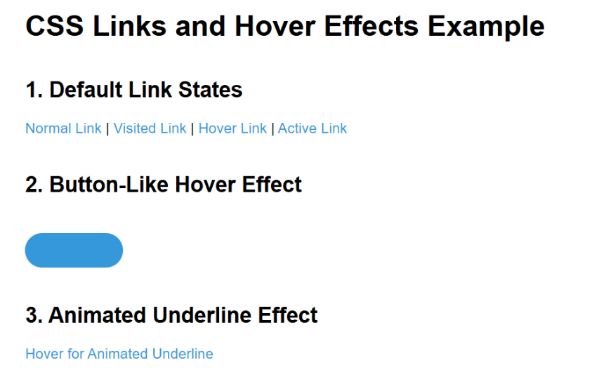
Output :
