Clean • Professional
CSS Grid is one of the most powerful layout systems in modern web design. It allows developers to create complex, responsive layouts with minimal code. Understanding Grid Lines, Tracks, and Areas is key to mastering CSS Grid. Let’s break them down in detail.
Grid lines are the invisible lines that define the boundaries of rows and columns within a grid container. They act as guides for placing grid items precisely on the grid. Every row and column is bounded by two grid lines—one at the start and one at the end.
grid-column-start / grid-column-end
Defines the starting and ending vertical grid lines for a grid item.
.item {
  grid-column-start: 2;
  grid-column-end: 4;
}
grid-row-start / grid-row-end
Defines the starting and ending horizontal grid lines for a grid item.
.item {
  grid-row-start: 1;
  grid-row-end: 3;
}
Shorthand: grid-column / grid-row
Combines start and end in a single declaration.
.item {
  grid-column: 2 / 4;
  grid-row: 1 / 3;
}
Grid tracks are the rows and columns themselves—the spaces between grid lines. Think of them as the tracks on which your grid items are placed.
grid-template-rows / grid-template-columns
Defines the size and number of rows and columns.
.grid-container {
  display: grid;
  grid-template-columns: 100px 200px 1fr; /* 3 columns */
  grid-template-rows: 50px 100px auto;   /* 3 rows */
}
grid-auto-rows / grid-auto-columns
Defines the size of rows/columns that are automatically created when items exceed the defined tracks.
.grid-container {
  grid-auto-rows: 80px;
}
grid-template
A shorthand property combining rows and columns.
.grid-container {
  grid-template: 50px 100px / 1fr 2fr;
}
Grid areas allow you to name sections of the grid and place items using names instead of numbers. This makes complex layouts easier to manage and read.
grid-template-areas.grid-area..grid-container {
display: grid;
grid-template-columns: 1fr 1fr 1fr;
grid-template-rows: 100px 200px;
grid-template-areas:
"header header header"
"sidebar content content";
}
.header {
grid-area: header;
}
.sidebar {
grid-area: sidebar;
}
.content {
grid-area: content;
}
<!DOCTYPE html>
<html lang="en">
<head>
<meta charset="UTF-8">
<meta name="viewport" content="width=device-width, initial-scale=1.0">
<meta name="description" content="Complete guide to CSS Grid Lines, Tracks, and Areas with practical HTML and CSS examples. Learn how to build responsive grid layouts.">
<title>CSS Grid Lines, Tracks & Areas Example</title>
<style>
  /* Grid Container */
  .grid-container {
    display: grid;
    grid-template-columns: 150px 1fr 150px; /* 3 columns */
    grid-template-rows: 80px 200px 100px;  /* 3 rows */
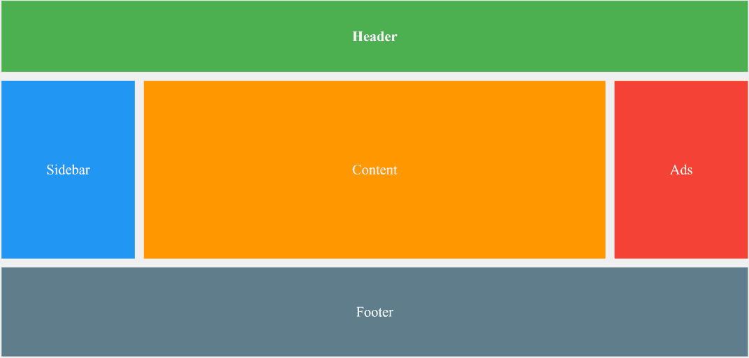
    grid-template-areas:
      "header header header"
      "sidebar content ads"
      "footer footer footer";
    gap: 10px; /* space between tracks */
    padding: 10px;
    background: #f0f0f0;
  }

  /* Grid Items */
  .header {
    grid-area: header;
    background: #4CAF50;
    color: white;
    display: flex;
    align-items: center;
    justify-content: center;
    font-weight: bold;
  }

  .sidebar {
    grid-area: sidebar;
    background: #2196F3;
    color: white;
    display: flex;
    align-items: center;
    justify-content: center;
  }

  .content {
    grid-area: content;
    background: #ff9800;
    color: white;
    display: flex;
    align-items: center;
    justify-content: center;
  }

  .ads {
    grid-area: ads;
    background: #f44336;
    color: white;
    display: flex;
    align-items: center;
    justify-content: center;
  }

  .footer {
    grid-area: footer;
    background: #607d8b;
    color: white;
    display: flex;
    align-items: center;
    justify-content: center;
  }
</style>
</head>
<body>

<div class="grid-container">
  <div class="header">Header</div>
  <div class="sidebar">Sidebar</div>
  <div class="content">Content</div>
  <div class="ads">Ads</div>
  <div class="footer">Footer</div>
</div>

</body>
</html>
Output:
