Clean • Professional
Modern web applications need to feel interactive and dynamic — transitions help achieve this.
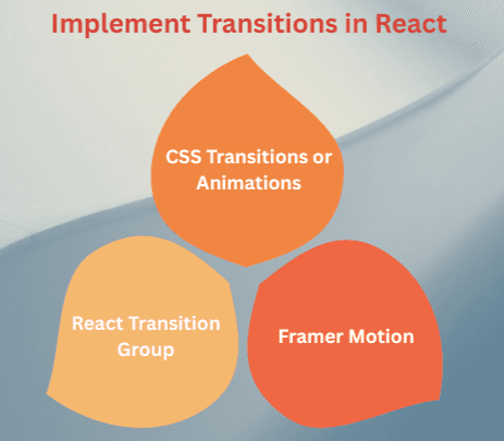
In React, transitions make UI changes smoother when components mount, update, or unmount — enhancing user experience without affecting performance. React doesn’t include built-in animation utilities, but it provides great ways to integrate transitions through CSS animations, React Transition Group, or libraries like Framer Motion.
Transitions in React are animations that occur when components enter, update, or leave the DOM.
They help you:
React transitions work seamlessly with the React component lifecycle.
There are three main ways to create animations and transitions:

Let’s explore each approach step-by-step.
You can use plain CSS transitions with React state to animate elements.
Example – Fade In / Fade Out with CSS
import React, { useState } from "react";
import "./styles.css";

function FadeExample() {
  const [show, setShow] = useState(true);

  return (
    <div className="container">
      <button onClick={() => setShow(!show)}>
        {show ? "Hide" : "Show"} Box
      </button>

      <div className={`box ${show ? "fade-in" : "fade-out"}`}></div>
    </div>
  );
}

export default FadeExample;
styles.css
.box {
  width: 150px;
  height: 150px;
  margin-top: 20px;
  background-color: skyblue;
  transition: opacity 0.6s ease-in-out;
}

.fade-in {
  opacity: 1;
}

.fade-out {
  opacity: 0;
}
fade-in and fade-out).transition property handles the smooth fade effect.React Transition Group is a popular library that provides animation hooks for React components when they enter or leave the DOM.
Installation
npm install react-transition-group
import React, { useState } from "react";
import { CSSTransition } from "react-transition-group";
import "./styles.css";

function CSSTransitionExample() {
  const [show, setShow] = useState(false);

  return (
    <div className="container">
      <button onClick={() => setShow(!show)}>
        {show ? "Hide" : "Show"} Message
      </button>

      <CSSTransitionin={show}
        timeout={300}
        classNames="fade"
        unmountOnExit
      >
        <div className="box">Hello React Transition!</div>
      </CSSTransition>
    </div>
  );
}

export default CSSTransitionExample;
styles.css
.fade-enter {
  opacity: 0;
}
.fade-enter-active {
  opacity: 1;
  transition: opacity 300ms ease-in;
}
.fade-exit {
  opacity: 1;
}
.fade-exit-active {
  opacity: 0;
  transition: opacity 300ms ease-out;
}

.box {
  background-color: lightcoral;
  padding: 20px;
  margin-top: 15px;
  border-radius: 8px;
}
CSSTransition tracks component entry/exit.classNames prop applies specific CSS classes during each transition phase.This gives full control over animation timing and effects.
| Phase | Class Applied | Description |
|---|---|---|
| Enter | fade-enter | Before the element enters |
| Enter Active | fade-enter-active | While entering |
| Exit | fade-exit | Before leaving |
| Exit Active | fade-exit-active | While leaving |
When rendering dynamic lists, you can animate items as they are added or removed using TransitionGroup.
Example – Animated List
import React, { useState } from "react";
import { TransitionGroup, CSSTransition } from "react-transition-group";
import "./styles.css";

function AnimatedList() {
  const [items, setItems] = useState(["React", "Vue", "Angular"]);

  const addItem = () => {
    const newItem = prompt("Enter a new item:");
    if (newItem) setItems([...items, newItem]);
  };

  const removeItem = (item) => {
    setItems(items.filter((i) => i !== item));
  };

  return (
    <div>
      <button onClick={addItem}>Add Item</button>

      <TransitionGroup component="ul">
        {items.map((item) => (
          <CSSTransition key={item} timeout={300} classNames="fade">
            <li onClick={() => removeItem(item)}>{item}</li>
          </CSSTransition>
        ))}
      </TransitionGroup>
    </div>
  );
}

export default AnimatedList;
styles.css
li {
  margin: 8px 0;
  background: lightgreen;
  padding: 8px;
  list-style: none;
  cursor: pointer;
}

.fade-enter {
  opacity: 0;
  transform: translateY(-10px);
}
.fade-enter-active {
  opacity: 1;
  transform: translateY(0);
  transition: all 300ms ease-in;
}
.fade-exit {
  opacity: 1;
}
.fade-exit-active {
  opacity: 0;
  transform: translateY(10px);
  transition: all 300ms ease-out;
}
If you need advanced animations with physics, drag, or gestures — use Framer Motion.
Installation
npm install framer-motion
Example:
import { motion } from "framer-motion";

function FramerExample() {
  return (
    <motion.divinitial={{ opacity: 0, scale: 0.8 }}
      animate={{ opacity: 1, scale: 1 }}
      transition={{ duration: 0.6 }}
      className="motion-box"
    >
      Smooth Animation with Framer Motion!
    </motion.div>
  );
}

export default FramerExample;
Why Framer Motion?
React transitions often depend on state changes (like toggling visibility or changing styles).
React efficiently re-renders only changed parts, and transitions ensure those updates feel natural.
Example:
When state changes, transitions create smooth visual updates instead of abrupt changes.
const [isVisible, setIsVisible] = useState(false);

<button onClick={() => setIsVisible(!isVisible)}>Toggle</button>